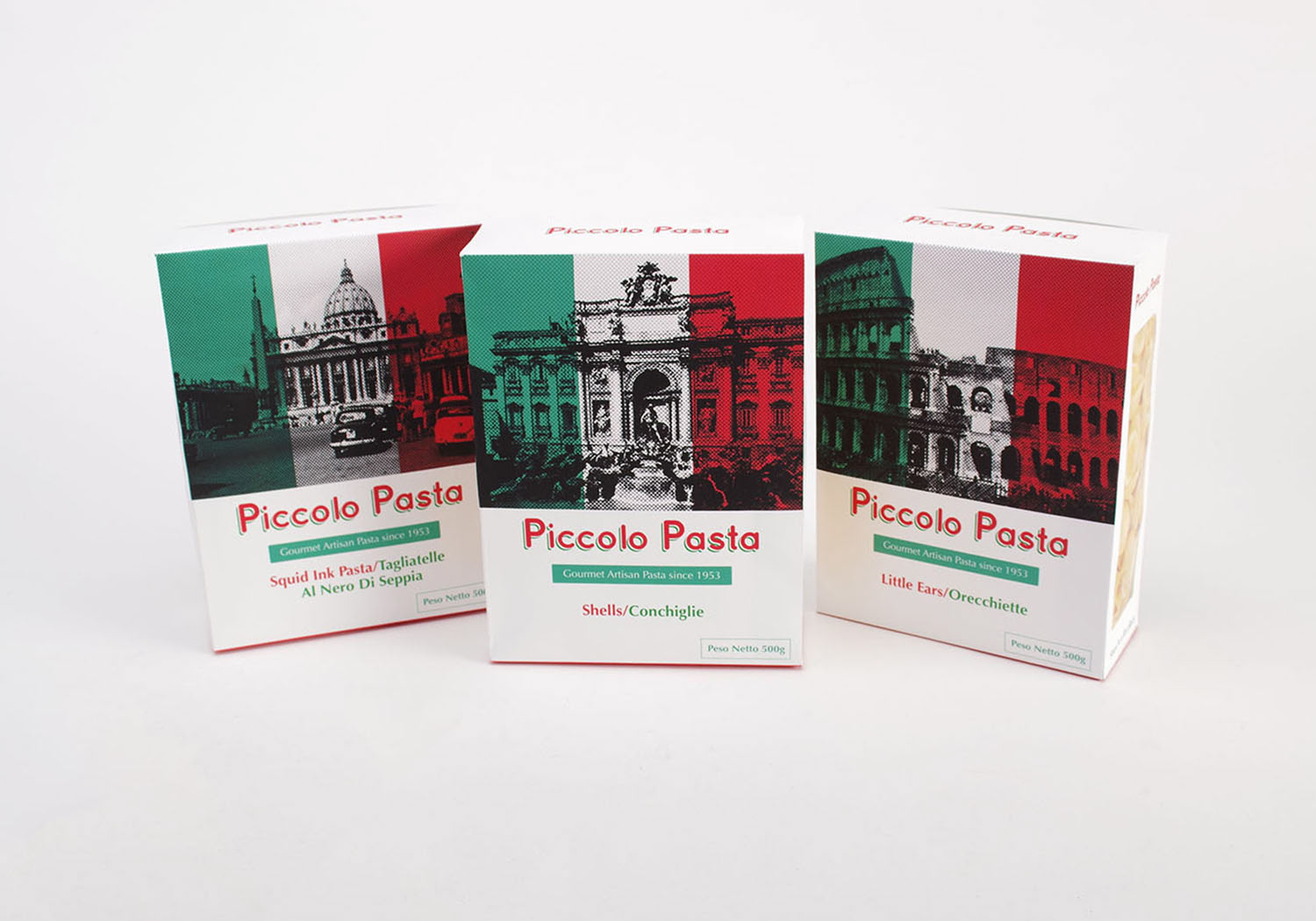
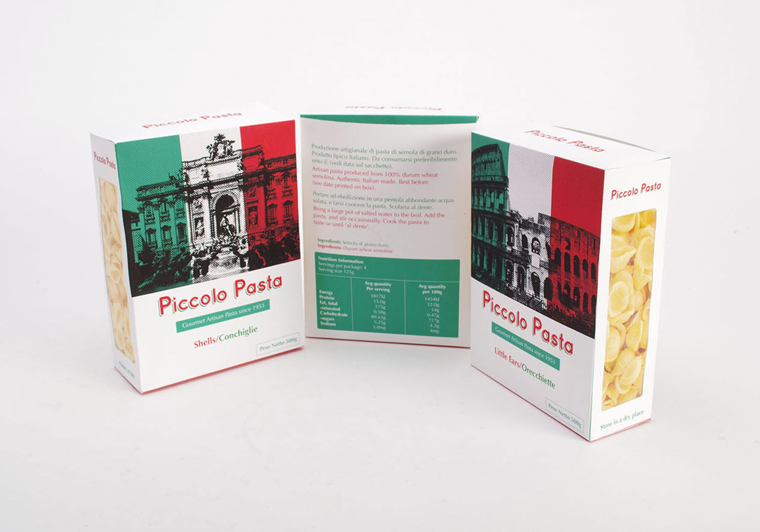

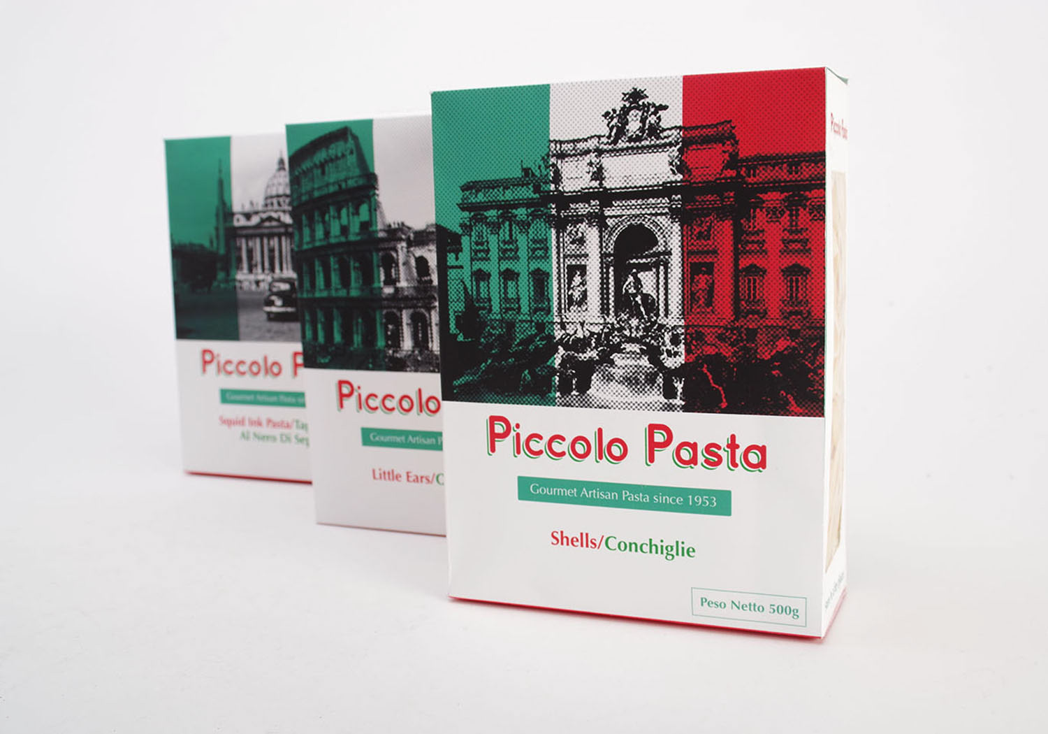
Packaging for Piccolo Pasta. The primary idea for Piccolo Pasta packaging is that I wanted the design to be elements that represents Italy. The brief requires that three colours to be use. Two Pantone and white. The Italian flag has three colours, green, white and red, which is where I got my colour inspiration from. The colours which was then used in the packaging. To make it more authentic, both English and Italian text is used on the packaging. Piccolo Pasta began in 1953 so I used black and white photos dating back to the 1950s. Photos of famous Italian landmarks like St Peters Basilica, Trevi Fountain and Roman Colosseum with halftone pattern dots is applied to them to give the total design integration.