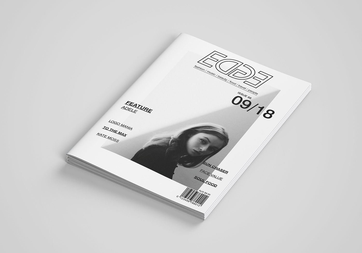
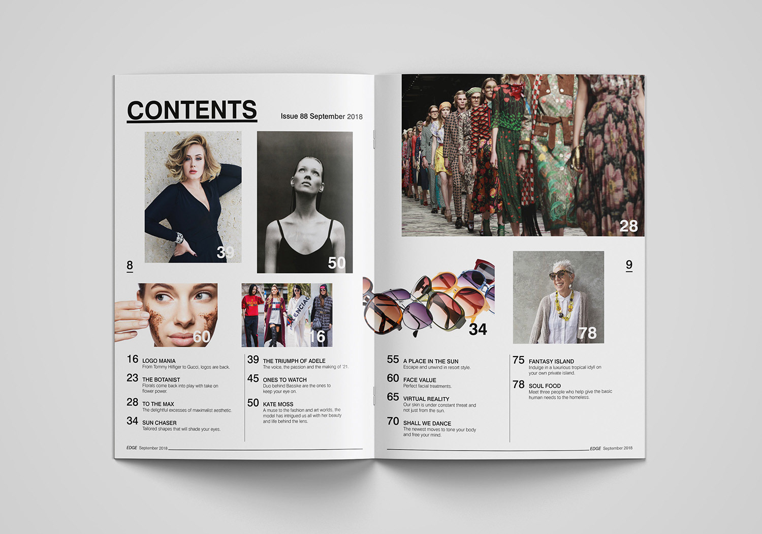
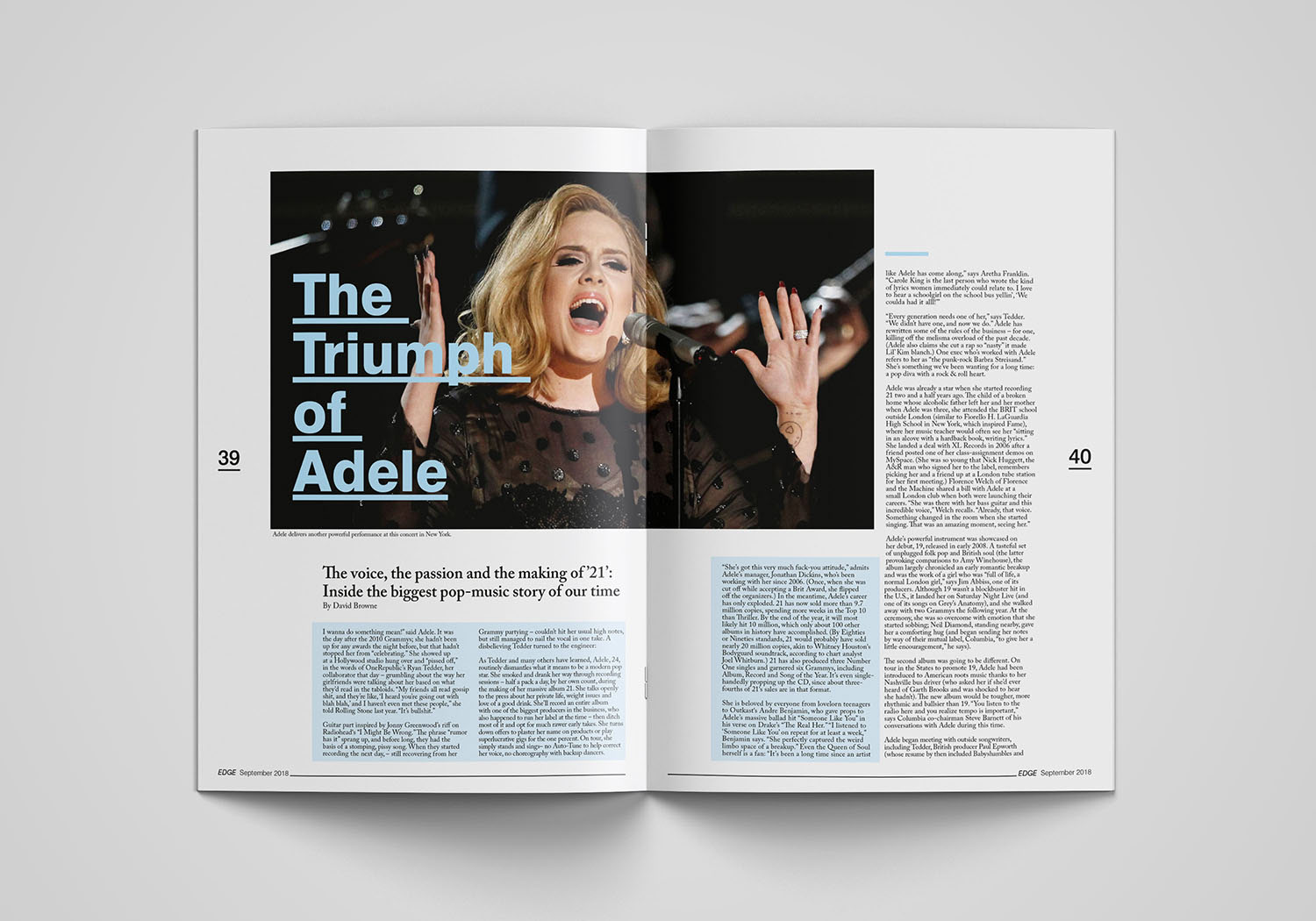

The design and page layout of Edge magazine. After experimenting with various typefaces to create the masthead, I finally chose Skia. Using this typeface allowed me to create the look of the letters D and G. I wanted the design of the masthead to convey the feeling that it had the edge over rival magazines at the news stand with the most forward, up to date, up to the minute with news and information. I used a eight column grid for the layout design of the magazine. I felt this was the most flexible when it came to laying out the pictures and type for the double spread of the pages.